I always appreciate well designed mobile menus. Especially because – as most of us do – I visit many websites only on mobile. The Divi Theme comes with a very simple menu solution for mobile devices, which always gave me the feeling of something missing.
I recently had the idea of displaying my social media links as kind of a separate menu on a full width and full height Divi mobile menu. Also, this additional menu should only be visible on mobile.
(I’m aware, that Divi Booster makes it possible to show the secondary menu, which involves also the links to your social media accounts. If you prefer this idea you can find a tutorial here:
https://divibooster.com/show-divi-header-social-icons-on-mobiles-divi-2-4/ )
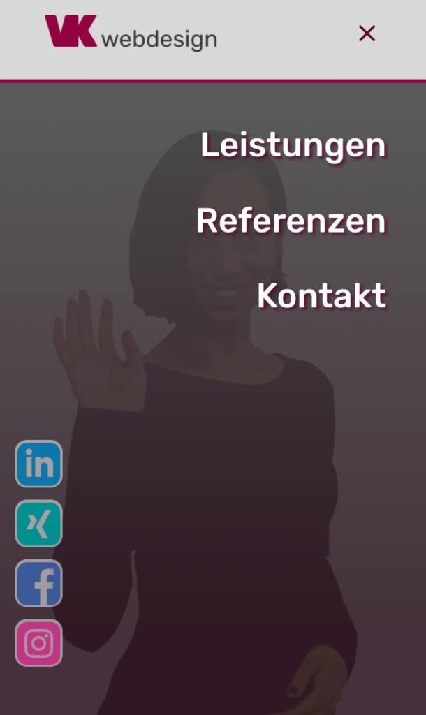
I haven’t found any solutions for what I was trying to achieve on the internet so I came up with this. And this is what it looks like on my website:
As this is my first tutorial ever, I expect that I will make some mistakes in explaining or even distributing code that doesn’t work for you. Please leave a comment if you have any problems with it or if you have any other ideas, links to tutorials and propositions for adjustments.
These are the steps to generate a social media menu, which is only visible on mobile:
1. Choose or download social media icons
First you need social media icons to display as your links. I highly recommend iconmonstr, where you can not only find many great icons but also you can customize them to your needs in terms of size and also color.
Upload the icons to your website.
2. Add social media links to your main menu
For the social media links add custom links to the primary menu. Insert the links to your social media accounts to the URL-field.
In the field “name” you add this code with the URL of the icon between the parentheses of src. Don’t forget to insert an alt atribute:
<img src="[url to your icon]" alt="" />Add the class only-mobile to the custom CSS field. Now also add separate CSS classes to every link so that you can target them specifically. I just used one, two, three, four. The classes are separated only by a blank space.
(If the field for custom CSS class isn’t shown, open the “screen options” on top and check the box “CSS Classes”)
Your menu links should look something like this.

3. Add custom CSS
What we’re doing with the CSS snippet I provide further below is this:
- Fix the header on mobile.
- Fix the mobile menu and set it to full width and full height
- We make sure that the social icons are not displayed on the desktop menu.
- Then we position the links as absolute and position all items 30px from the left.
- We define the width for the images.
- Every menu item is positioned individually from the bottom.
- I also added a media query for smaller screens.
/* make mobile menu full width and full height, fix the mobile header */

@media (max-width: 980px) {
 .container.et_menu_container {
    width: calc( 100% - 60px);
 }
	header#main-header {
		position: fixed !important;
	}
}

.et_mobile_menu {
    margin-left: -30px;
    padding: 5%;
    width: calc( 100% + 60px);
	height: calc(100vh - 76px); /* adjust 76px to the height of your mobile header */
}


/* position and size the social media links on your mobile menu */

@media (min-width: 981px) {
    .mobile-only {
        display: none !important;
    }
}

li.only-mobile {
	position: absolute;
	left: 30px;
}

li.only-mobile img {
	width: 70px;
}


/* insert the specific class to each menu item and position them */

li.only-mobile.four {
	bottom: 390px;
}

li.only-mobile.three {
	bottom: 300px;
}

li.only-mobile.two {
	bottom: 210px;
}

li.only-mobile.one {
	bottom: 120px;
}


/* add media query to adjust the size and position for smaller screens */

@media (max-width: 600px) {

	li.only-mobile img  {
		width: 40px;
	}

	li.only-mobile {
		left: 20px;
	}

	li.only-mobile.four {
	bottom: 230px;
        }

    li.only-mobile.three {
	    bottom: 180px;
    }

    li.only-mobile.two {
	    bottom: 130px;
    }

    li.only-mobile.one {
	    bottom: 80px;
    }
}
And that’s it!
Feel free to play around with the positioning and sizing of your social icons or whatever you want to display here as a link.
If you have any problems with the code or any other part of this tutorial, please leave a comment.
If you have other ideas or solutions or tutorials for similar mobile menu possibilities for the Divi theme or if you have any questions about other parts of my mobile menu, please also leave a comment.
Best regards,
Viktoria
0 Comments